Showing posts with label color. Show all posts

Wednesday, October 19, 2011

I just went through all of the posts I had done within the past year or so, and realized they're all wedding planning,

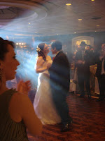
and I realized I never posted any pictures of the actual wedding.

So here they are:


Thursday, April 8, 2010

Antique Pink and Sage


I made these two color palettes off of the two dresses one of my wonderful bridesmaids liked. They're both from The Dessy Group again, but this time in Sage.

The first palette was made second, and is a lot simpler. The bottom one is really just a collection of ideas and images that vaguely fit into the color scheme and that I like. The top one is quite a bit more selective.

Ideas? Opinions?


Tuesday, April 6, 2010

Pink and Green


For the wedding's color palette, I've been wavering between Pink/Green and Blue/Green. As much as I love blue, I'm leaning strongly towards pink/green.

However, I hate hot pink. And I'm not sure if I want a vibrant pink. I would prefer a softer, paler pink if possible. I've even been thinking of a peach or coral instead of/or with a pink.

I've been on the fence about it, but after seeing yesterday's 100 Layer Cake post, I'm thinking that might be the way I'll try to go.

Guest Blogger, Snippet and Ink writes

I love playing with colors, seeing if I can make predictable color palettes new, or pairing colors that might not seem obvious together. Pink and green is still a favorite for weddings, and I imagine it always will be, but it can come across as saccharine and unsophisticated. Black tones down the sweetness, and makes it all look chic.

Palette: melon-mint green, pale grapefruit pink, black avocado.

Here are a few more color palettes that incorporate peaches and corals that I like.

A gorgeous collection of coral Etsy products.

A really cute celery and peach palette.

A nice peach, orange and aqua one. I don't love the orange, but the peach is really cute.

I also really like this spring-themed collection - the flowers are my favorite part.

All of these palettes are from The Perfect Palette, a delightful blog that has very pretty, creative wedding palettes.

Tuesday, February 9, 2010

New Layout!

Look at my lovely new layout! It's absolutely perfect! I found it on this AMAZING Blogger layout site called Suck My Lolly. Isn't that adorable? Even though I think this new layout is the greatest thing ever, I might have trouble resisting some of the other absolutely adorable layouts. I mean, look at this and this and this and this . I want them all.

Thursday, February 4, 2010

Details

Here are some of the details that didn't quite fit into my overall room theme of the last post. This is, again, a homage to Design*Sponge because they have SO MUCH GREAT STUFF on their blog and you should go read all of it and look at the pretty pictures.
The absolutely genius and adorable book book... well, I really have nothing witty to say about it. It looks perfect. And I want it. The end.

The desk also looks like the perfect combination of functionality and adorableness. I love the space and the clean white lines. I love all of the opportunities for storage and organization. I love the little candy (nut?) dispenser. I love the giant wall of personalized stuff.


This wreath is actually the reason I found this delightful blog (my wonderful friend Sam saw it and thought of me! THANKYOUTHANKYOUTHANKYOU). I love that it's not a traditional holiday winter wreath with the holly and the evergreen boughs. I love that it's not a traditional spring/summer wreath with flowers and butterflies. It's perfect. It's late winter. It's the hope of spring.


And the ranunculus bouquet is just gorgeous. I love these flowers for so many different reasons, but I would love to more than anything to have little bunches of them in low vases decorating my rooms. I would LOVE to have a kitchen like this, but it would require me to gain some organization and tidiness skills that I have been lacking for the past 23 years. Maybe I'll find them someday. Maybe not. Either way, gorgeous kitchen. And guess what? The rest of the house is just as cute... wait for it... and realistic looking! It doesn't look like a display house, it looks like a real home that people actually live in. I love it.

Friday, January 8, 2010

Sample Blue Green Pale Pink

Okay, so this palette focuses on the pale pink ranunculus, with heavy influence from the blue hydrangeas, delphinium, larkspur and blue bells. There are also green hydrangeas, as well as white viburnum and astilbe.

Sample Blue/Purple/Green Color Palette

This is the temporary one I threw together. There will be a newer, better one that's organized properly and has all of the references. Until then, enjoy the pretty colors.

There are blue, purple and green hydrangeas, as well as blue delphinium and blue bells. There is a purple rose and lilacs, and the bouquet on the bottom left is stunning, even though I'm not sure what the blue flower is.
Related Posts with Thumbnails
 
Header Image from Bangbouh @ Flickr